Off-by-one
Well, I fixed the off-by-one glitch mentioned here.

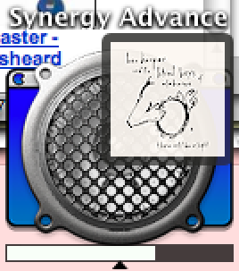
The fix was very simple. First, I took some screenshots and was inspecting them at high zoom trying to work out the exact nature of the fault. Once I had some initial predictions in place I decided to remove some minor adjustments and see if the fault at best went away or at least was shown any more clearly; turns out the fault went away entirely and as you can see both the border around the cover art badge and the track progress bar are much clearer and sharper now, with no unnecessary anti-aliasing.
I was at first a little puzzled why this is the case. I had explicitly added 0.5 to some of the coordinates used during the drawing process because I want to make sure that my lines coincided with screen pixels rather than abstract coordinate system pixels. Evidently my understanding of the Cocoa drawing system was a little misguided; Apple's docs say:
Once in device space, you can manipulate your coordinates as needed to make them look the way you want. In the example, the object boundaries are normalized to integer coordinates and then shifted by 0.5 units to produce crisper boundary lines.
But as Chris Hanson notes it is a little more complicated than that:
Of course, sometimes you want to do something device-specific like draw a hairline. You don't want to specify that the line is 1 point, or 0.5 points, or 0.1 points, or... So the PostScript imaging model gives you a shortcut; you can set the line width to 0.0, and this is interpreted as "the thinnest line you can draw on this device."
Quartz complicates things further because right now its primary rendering target has a relatively low resolution (72dpi). It employs antialiasing to get a higher effective resolution out of the screen. Drawing on the coordinates means that a one-point line will half-cover two device pixels, which means it has to antialias to make the line appear correctly.
But on a 72dpi screen, that's not necessarily the effect you want. So you can shift the 72dpi user coordinate system by (0.5, 0.5) to make rendering occur down the center of the 72dpi device coordinate system. You need to be aware exactly why you're doing this, though, so you can avoid doing it in situations where the user and device coordinate systems aren't identical.
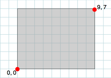
It's all a bit confusing but with the aid of a few images all should become clear... First up, we have a simple rectangle with origin 0, 0 and size 9, 7 (width, height):

Note that when we fill the rectangle the integral coordinates give us a clean rectangle whose contents exactly correspond to screen pixels and there is no anti-aliasing.
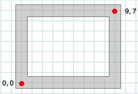
But note what happens if we instead draw only the edges of the rectangle. The sides are lines of width 1, the bottom left corner has coordinates 0, 0 and the top right corner is at 9, 7:

Note that despite the identical coordinates this rectangle does not match the previous one. The lines are one pixel wide but they straddle physical screen pixels and so when rendered to the screen will probably be anti-aliased and are likely to be blurry. To correct this we would instead have to locate the bottom left corner at 0.5, 0.5 and the top right at 8.5, 6.5.
This was the mistake I made when I first made the tweaks to my Dock icon code. I forgot that the offset-by-half-a-pixel trick only made sense for drawing lines, not filled rectangles. This is why my progress bar looked blurry.
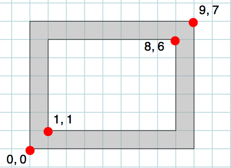
In the case of the cover art border I made the same mistake. This was not drawn using lines (although it is drawn using an NSBezierPath) and so it is a mistake to offset the coordinates by half a pixel. The "donut" is basically an outer rectangle with a hole cut out of it, defined by another rectangle, and so the offset-by-half technique should not be applied:
